
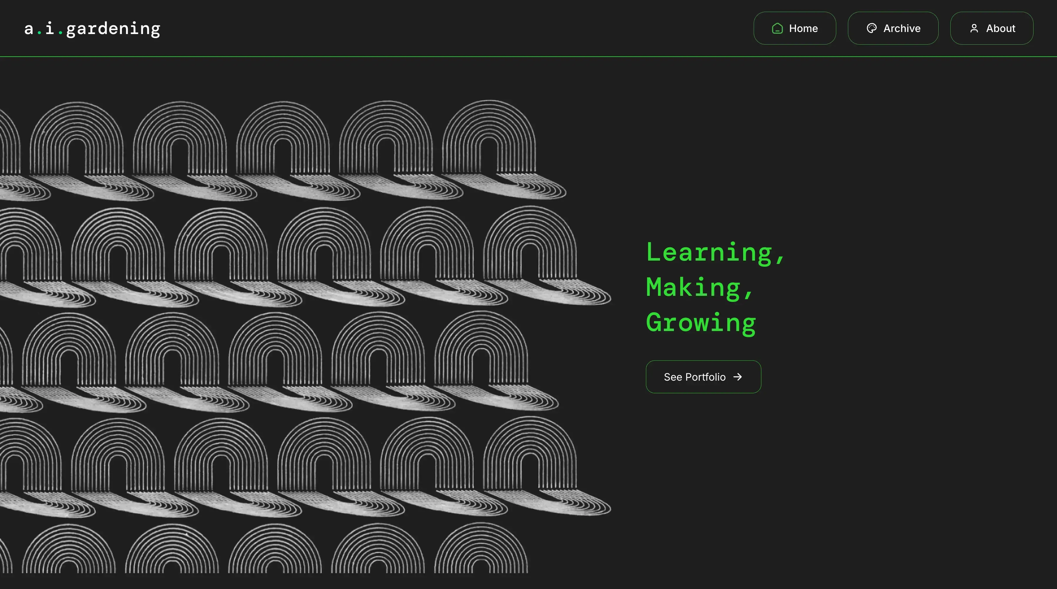
a.i.gardening
A bespoke publishing platform for an artist whose work spans digital art, NFTs and long-form writing. Built to keep complex content practical to manage without compromising the design. Design by Nat Goddard Design, built by me.
- Type
- Blog / CMS
- Design
- Nat Goddard Design
Built for the content
The designs came from Nat and were detailed and specific. The content types were unusual, the layout had its own logic, and the project needed something built around it rather than squeezed into a ready-made platform.
I built the site from Nat's Figma designs using React and Tailwind. The translation wasn't purely mechanical. Each content type needed its own decisions about how it should behave and display at different screen sizes, so the final build stayed faithful while remaining easy to use.
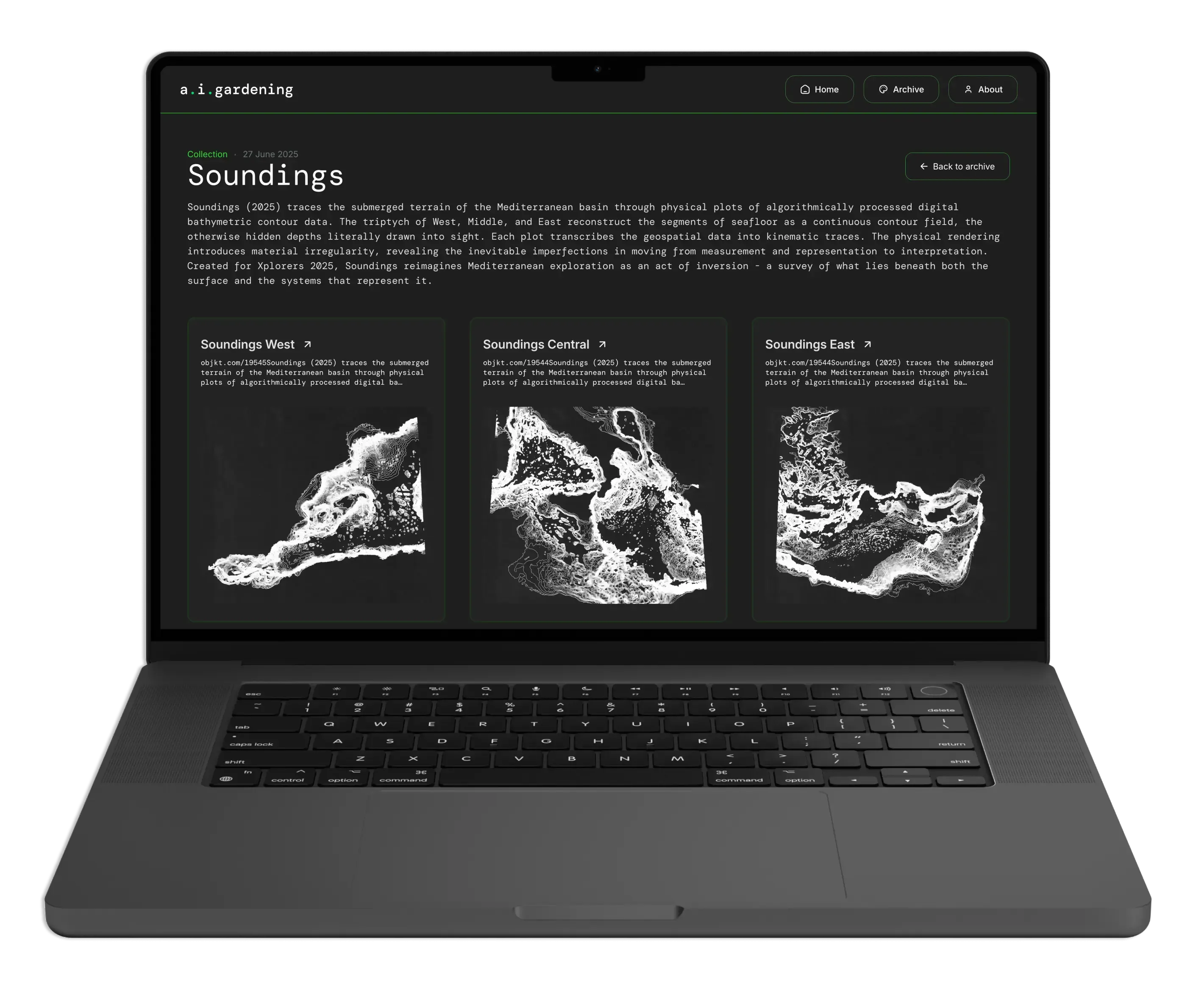
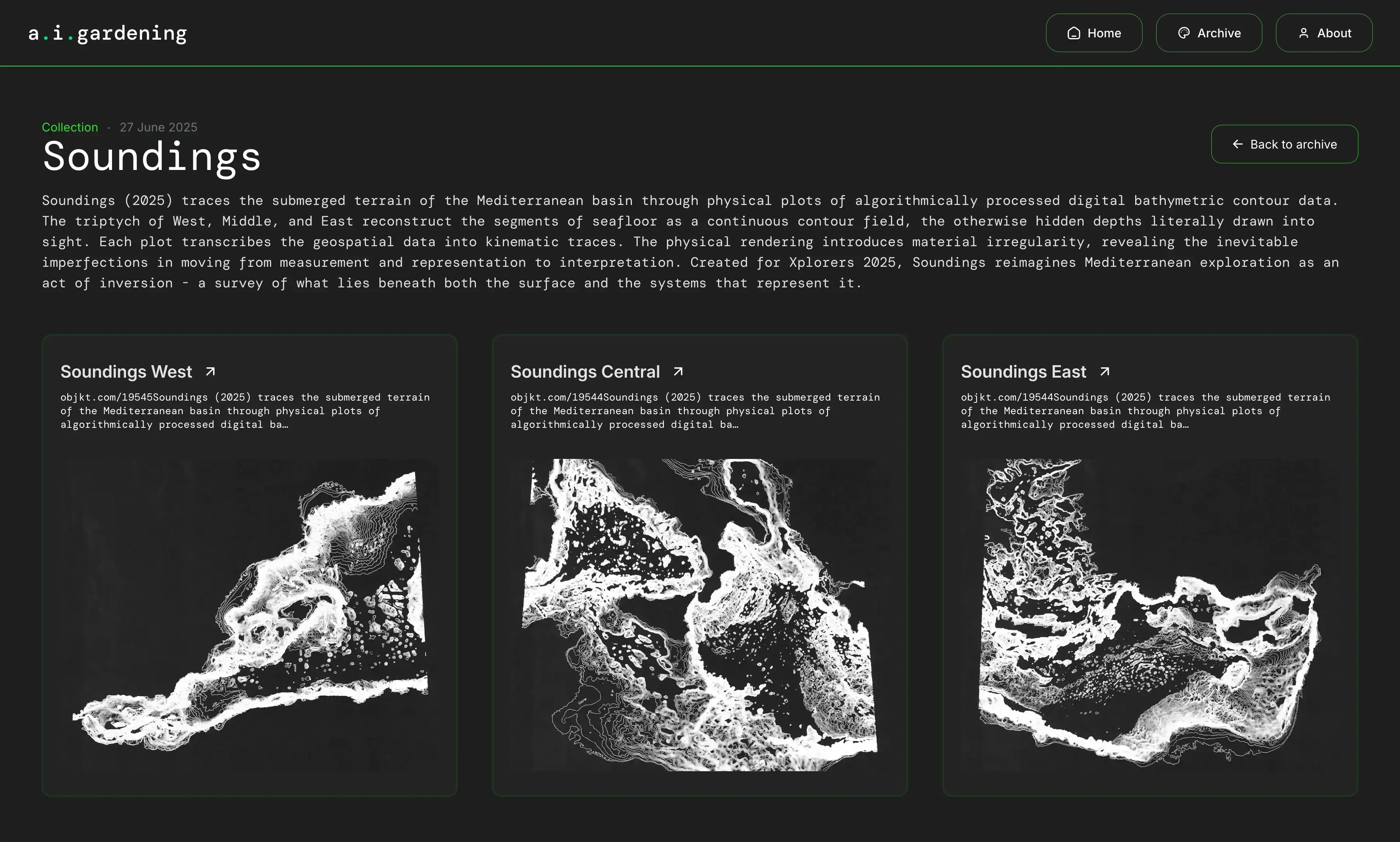
The site publishes long-form articles, photography, video and visual NFT artworks embedded from Objkt, the Tezos marketplace the client publishes on. Each needed its own layout and its own fallbacks for when things aren't available. Getting all of it to sit together consistently took a fair bit of work.
A CMS built around the content
Rather than a standard blogging platform, the site is backed by a custom content system built around how the work is actually organised. Images belong to articles. Articles belong to collections. That structure carries through to the site, so he's working with a proper archive rather than a flat list of posts.
He manages everything himself: articles, artwork, tags, video and embedded NFTs. He can publish what he likes and when he likes, and the site is flexible enough to handle it. There's quite a lot going on under the hood, but his end of it stays simple and sustainable.
It's built to grow with the work. However much gets published, in whatever mix of formats, the structure is already there for it.